BORDERLESS CO.LAB AMNH STORE
Competitive Analysis
The number of global money transfer products and services are so vast and varied, here we compare the fees and speed of transactions
We spent some time focusing on borderless’ competition to understand how they were handling fees and speed of payment. We found that FairFx was our direct competitor.

From here we ran an analysis with FairFX and other payment platforms using our three design principles: clear, useful, and desirable.
Design
Three key principles emerged from the research towards guiding the wireframes
The persona development, competitive landscape, and heuristics analysis provided context to who and what we are striving for. To streamline and summarize our learnings, I created some design principles to guide us in our mobile app ideation. Here they are:

Ideation
Kicked off design with several rounds of rapid prototyping using Design Studio and thinking about features we 'must' and 'should' implement
From our personas and design principles we came up with a list of features for our product. We generated a big list and were able to narrow the key features for a MVP using the MoSCoW method. Most important features included making and receiving a payment, tracking your finds, and inviting contacts to borderless. Other secondary features were geo-location detection for currency and set up a recurring payment.
Next, we began our ideation with several rounds of wireframes in a collaborative exercise called Design Studio. I invited the CEO and a few more designers for this exercise. Here are a few key sketches:

Initial sketches created in Design studio
Wireframe Concepts
Medium fidelity wires show how we introduce users to the app and streamline account setup
We performed a total of 6 sprints to design the app experience. We made every effort to meet ensure our design communications were clear, desirable, and useful.

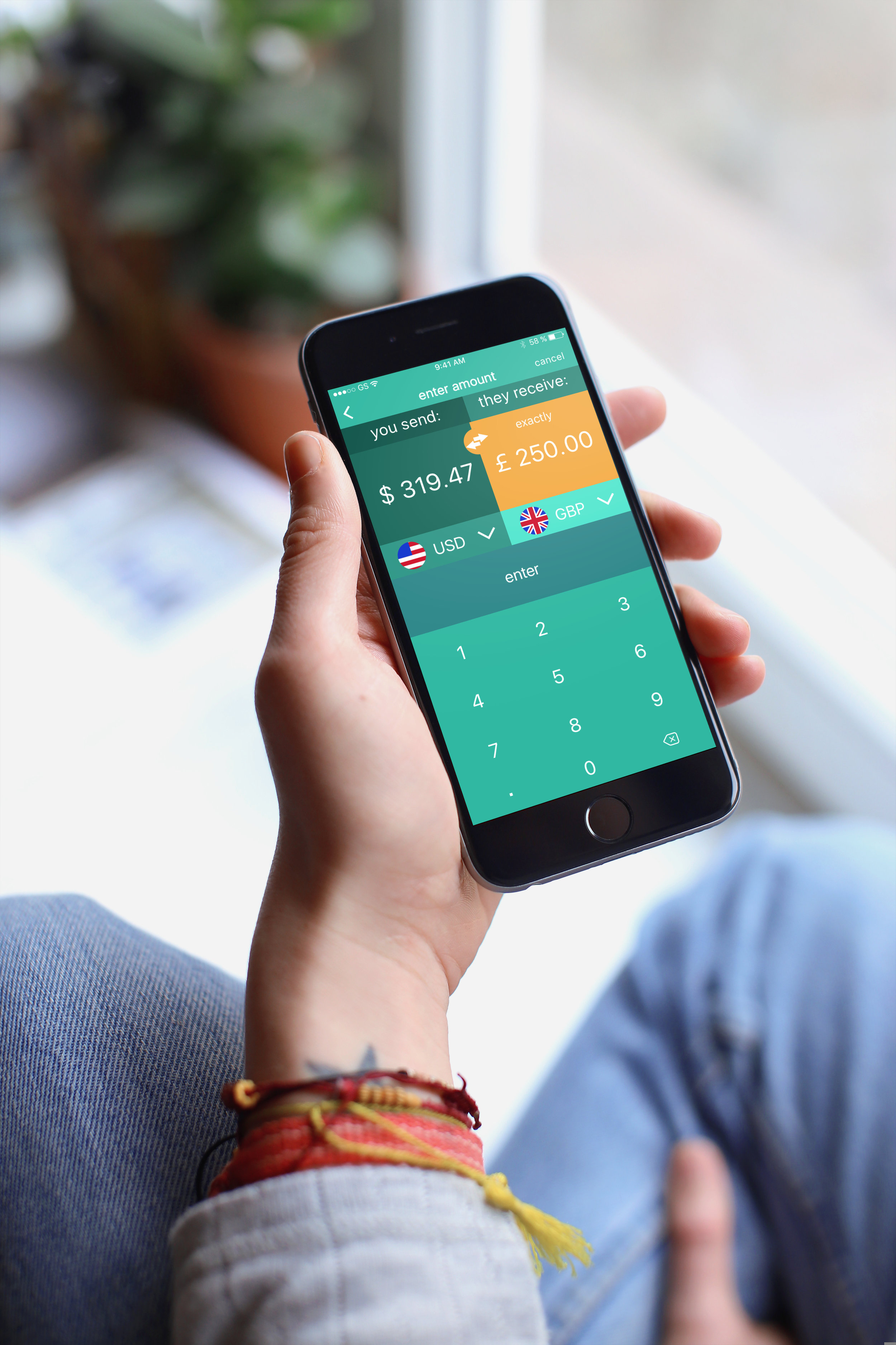
Currency conversion medium wireframe

Currency conversion medium wireframe
Usability Testing and User Flow
One of the problems we were solving for was how can we make the on boarding process less laborious and time consuming?
We created a working prototype of the onboarding flow. After conducting a number of tests with our core users, we were certain this user flow was indeed the clearest, most useful and desirable. The majority of users liked the fast and simple nature of it, while some remarked on wanting more information through each step. This led to the adding a signifier for FAQ where it's relevant.

User flow for onboarding process