Borderless
Creating value for users and developing the MVP for international payments
User Experience Research, Product Strategy and Design
Overview
Sending international payments is expensive and frustrating
People complain about hidden foreign transaction fees, and payments usually take a long time. Borderless is a mobile app that aims to make global payments faster and easier. Users can exchange currency and make an international payment to their friends, family or a business.
I worked with a team of designers to create a mobile app experience for launch of borderless. My responsibilities included user research, brand positioning, usability testing, and design.
Defining Goals
To stay true to Borderless’ value proposition and be competitive, we wanted to make international payments easy, fast, secure, and fun.
We conducted comprehensive user research and competitive analysis across international, mobile payment apps and services, and found that our design solution should include these attributes:
Design is friendly
Onboarding is explanatory and engaging
Payment process that is intuitive and easy
Information architecture that is clear and transparent

Exploring
The number of global money transfer products and services are quite vast and varied.
We spent some time studying payment services all over the world. I was particularly interested in understanding how each competitor handled the amount of fees and speed of payments.
“Mobile payments use has become widespread: Forty-six percent of U.S. consumers report having made a mobile payment, which translates to approximately 114 million adults.”
In our competitive analysis, we saw that FairFX offers faster payments and lower fees, and could be a direct competitor of ours.

I conducted a heuristics analysis of FairFX and found the user experience, communication and visual design is confusing and hard to use.
The competitive advantage is to be transparent with fees and speed of payment, while offering a safe, easy-to-use mobile app experience.

User Research & Insights
We conducted one-on-one user interviews with people ages 25-64 who had spent time living abroad.
The median age of our users was 32, which fit exactly in the range of people who would adopt mobile payments, according to Pew Charitable Trust Research and Analysis. Additionally, our users have sent money to places like the United States, United Kingdom, Belgium, Israel, Korea, and Mexico.
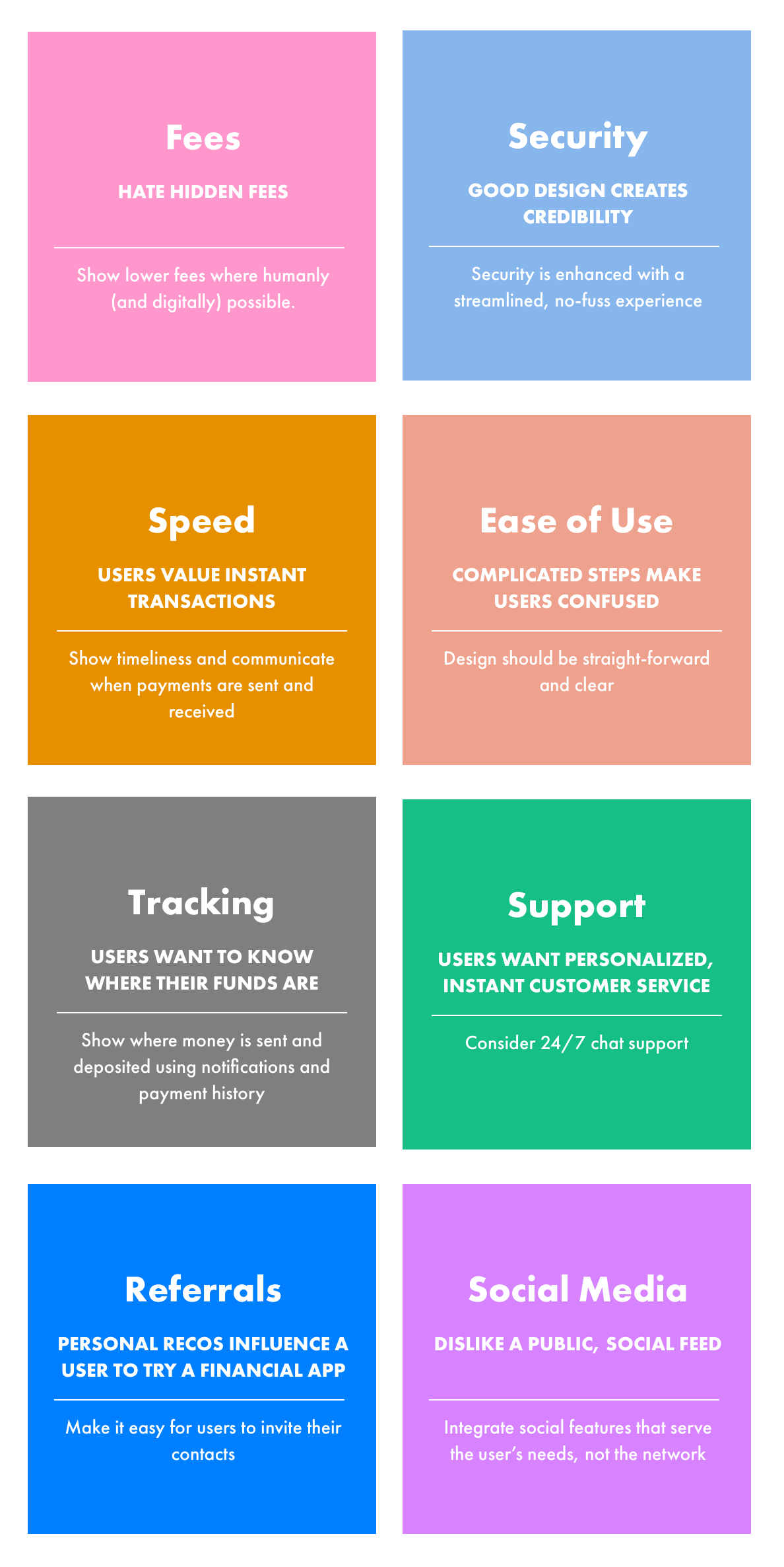
International payment activities include living in Europe and paying US student loans, working in the US and sending money home, and sending money to charities or family abroad. We identified some key themes in an affinity mapping exercise below.

Next I created insights and design implications to summarize our research, shown below.
The user research and pattern synthesis provided a foundation to accurately craft personas for our MVP.
The personas would become useful artifacts to refer to when designing the consumer journey and wireframes for the MVP.

Refining
I created an easy-to-update user flow and modular design system based on what resonated most during testing.
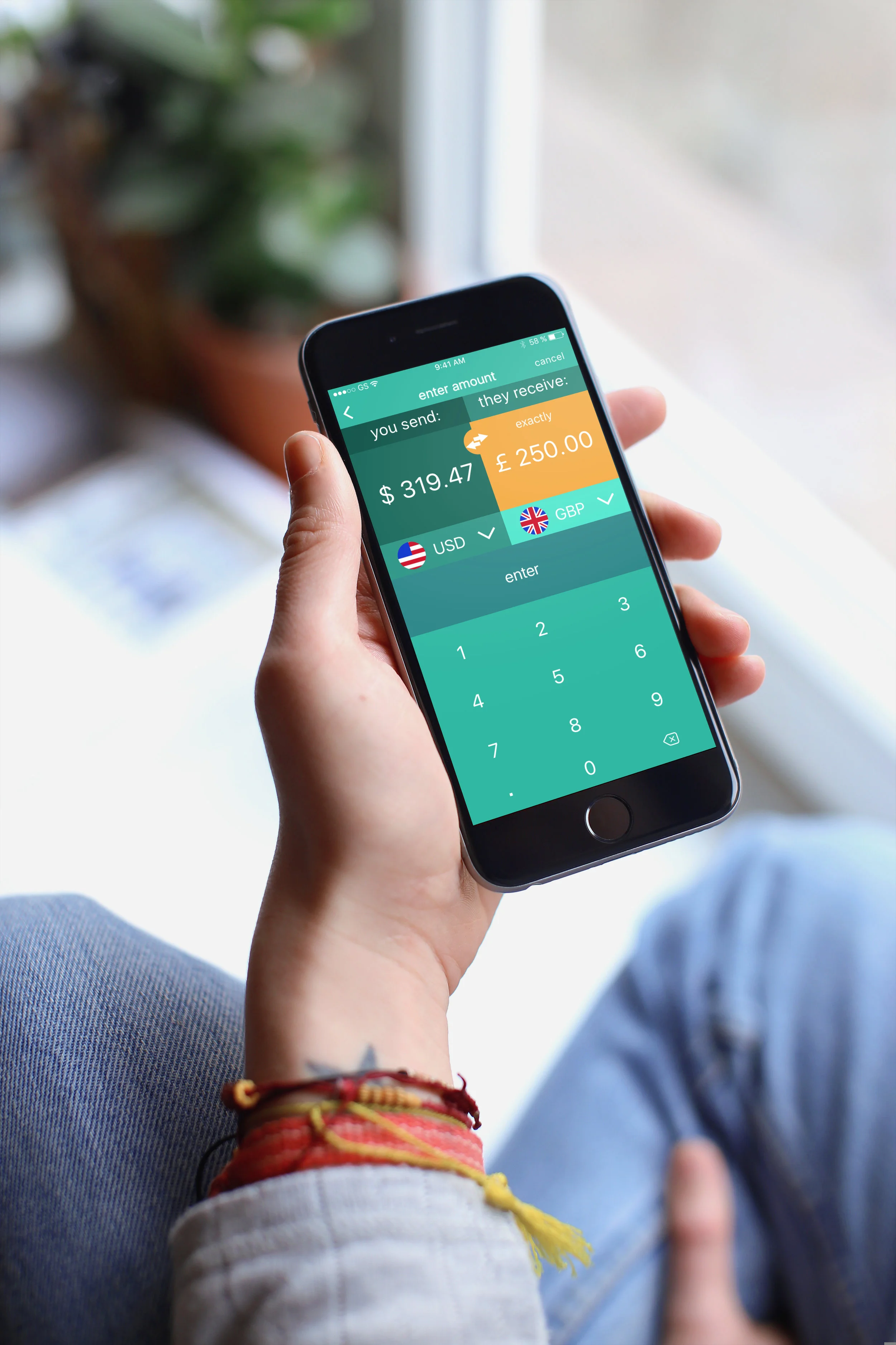
Below are a few examples of the high-fidelity wireframes I designed.

Components
A well-organized sketch file of design components made it easy for the internal team to reference.
Borderless' internal team then carried out the visual design and development of the app. Below are a few examples of the MVP.

Results
Borderless went on to showcase at the Unbank Venture Fintech Incubator in Silicon Valley and INV Fintech in New York City for best new product in blockchain international payments.

Let's work together
I'll partner with you to hone in on a strategic vision, uncover users' needs, and launch a brand, product, or service that stands out.